WANs and Applications
This frame displays for the Client:
| • | 2 Synthesis diagrams of connectivity and traffic |
| • | 2 Details graphs, one historical graph showing the evolution of the WAN throughput on each WAN and one detailed graph for connectivity |
Synthesis - WAN Connectivity
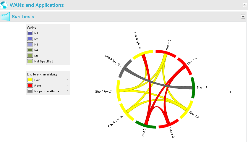
This chord diagram shows the end-to-end connectivity issues between the different Sites across the different WANs.
By moving your mouse over a WAN in the legend, you can highlight the traffic across the corresponding WAN:
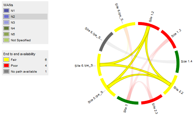
By clicking that WAN, you can remove it from the display (then it turns blank in the legend):
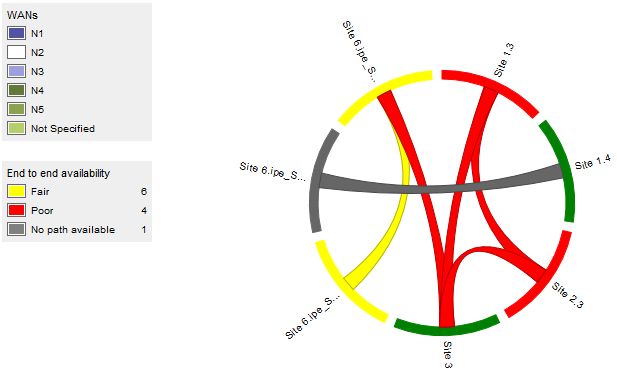
Click it again to show it again.
The same applies in the second legend, End-to-end availability. The latter can be "Fair" (99-80% of availability), "Poor" (< 80% of availability) or "No path available" (the normal state is "good", but it is not displayed so as to avoid saturating the graph).
By moving your mouse over an arc (i.e., a Site) in the diagram, you can show the traffic of the corresponding Site, only. A pop up shows the Availability (in percentage) and Stability (in number of state changes) of the network between this Site and the remote ones:
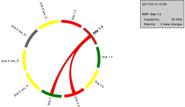
By clicking that Site, you can open a new view in the dashboard, on the selected Site.
By moving your mouse over a chord (i.e., a flow between two Sites) in the diagram, you can highlight it. A pop up shows the Availability and Stability of the network between these two Sites:
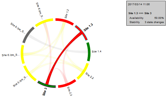
By clicking that flow, you can open a new view in the dashboard, on the first (in alphabetical order) of the two Sites*' Activity Summary.
Synthesis - WAN Traffic
This donut diagram shows the instantaneous (dashboard time) throughput and distribution of the top 7 Application Groups per WAN. One slice represents the remaining Application Groups.
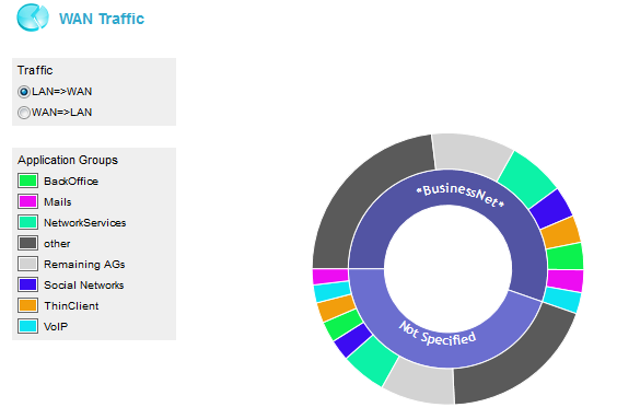
Either select LAN -> WAN or WAN->LAN for defining ingress or egress directions.
In the current diagram, the two internal slices of the donut correspond to two WANs, respectively named 'BusinessNet' and 'Not Specified'.
By moving your mouse cursor over the external colored slices which correspond to the application groups of both WANs, you can display the throughput of each application group in the middle of the donut.
The following picture highlights the throughput, in kilobits per second, of the 'Mails' application group from the 'BusinessNet' network.
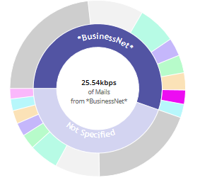
Note that the 'Remaining AGs' slice represents the remaining application groups per WAN, which are not included in the top 7 AGs. The provided value is an aggregation of the remaining AGs throughput values. The top 3 application groups are specified. The 'Other' slice corresponds to unrecognized traffic.
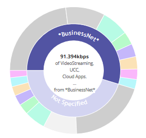
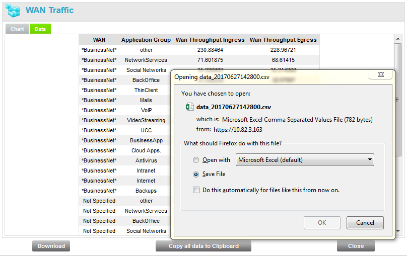
As with the WAN Connectivity chart, you may export the WAN Traffic diagram and data by right-clicking an AG and selecting the Export function. You can either download:
| • | the chart as a .png image or |
| • | all data as a .csv file |
WANs and Applications - Details
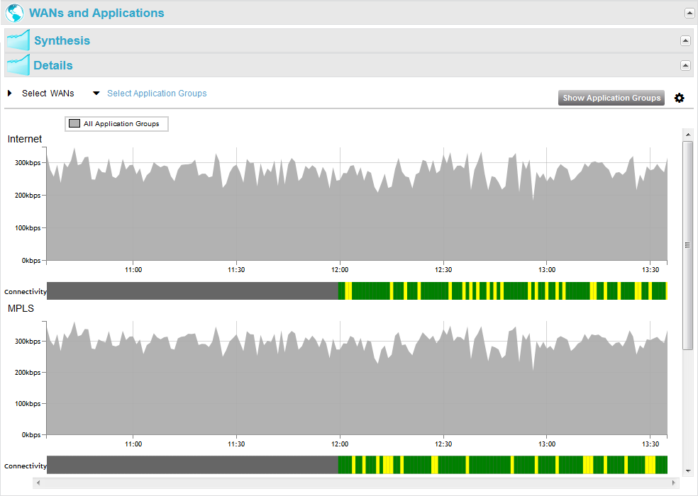
The covered period and the granularity of the data in the Details graphs depend on the time span: it can be three hours of per-minute information, if the time span is the minute (you can scroll the past hours with the horizontal scroll bar at the bottom of the graph), or it can be the last three days of hourly average information, if the time span is the hour.
The Connectivity graphs show the connectivity state of the available WANs. They can have four colors:
| • | green: 100% of connectivity |
| • | yellow: 80%-99% |
| • | red: < 80% |
| • | grey: not measured |
Exclamation marks indicate problem of stability (i.e. more than two changes during a collect).
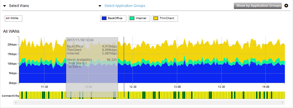
Connectivity problems are indicated in the pop-up when pointed with the mouse:

It is possible to show the graphs WAN by WAN (default view) or aggregated for all WANs, or for some WANs only, with a click on the arrow before Select WAN followed by a click on one of the WAN names. Modify your selection in the popup window through the Select Siblings/Unselect Siblings button and click OK to validate.

In the same way, it is possible to show the graphs for all Application Groups (default view) or for some Application Groups only, with a click on the arrow before Select Application Group followed by a click on one or several Application Group name(s) in the popup window. If you selected one Application Group, you can use the Select Siblings button to select again all the Application Groups. Click OK to validate.

As a result, it shows the distribution of the selected Application Groups on each selected WAN:
Hit the![]() icon in the upper right corner of the frame to modify your display through the following options:
icon in the upper right corner of the frame to modify your display through the following options:

| • | Traffic: select traffic direction from the LAN to the WAN or from the WAN to the LAN. |
| • | Scale: if you select the 'Volume' option, throughput is specified in kilobits per second. If you select the 'Proportion' option, throughput is specified in percentage of the volume, with respect to the Y left axis. |
| • | Panel height - number of graphs: according to the number of available WANs, you may define the number of graphs to display. The default option is 2. WAN graphs are displayed in alphabetical order. |
The Show by Application Groups button toggles the view and shows the throughput evolution per Application Group and its AQS:
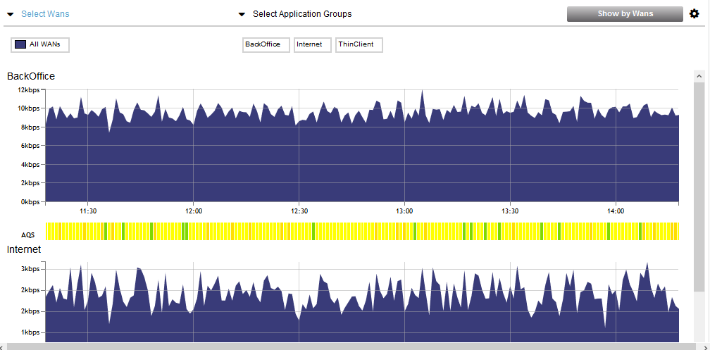
So instead of showing the distribution of the selected Application Groups on each selected WAN, this view shows the throughput evolution of the selected WANs for each selected Application Group.
The Show by WANs button toggles back to the previous view.
Also see "WANs and Applications" for the Site.